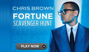
Marketing Campaign for Chris Brown - Fortune
Special Edition Album
Along with the original version of the album, a special edition album was also released with bonus songs included, and a different album cover, for around £3 extra than the standard version. Because of platforms such as iTunes and Youtube, people can listen to clips of the songs before actually purchasing them. In-fact, because of the internet, it is possible to download the complete special edition album for free within minutes. Fans of the artist are much more likely to purchase the physical, special edition album, instead of purchasing the standard one.
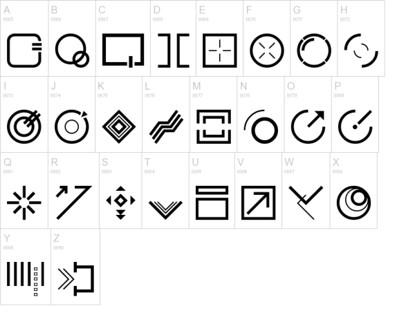
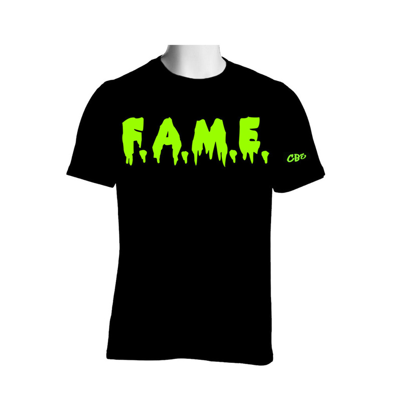
Font
The font of the album was extreme unique as the actual lettering had been created by the artist/record label themselves. They conducted a 'scavenger hunt' for fans to answer, with prizes to be won. The coding telling people what the symbols mean't allowed fans to interact with each other through the unique style of font. The font also appeared on all the posters and the album itself, giving continuity but innovation to the album cover and marketing campaign.
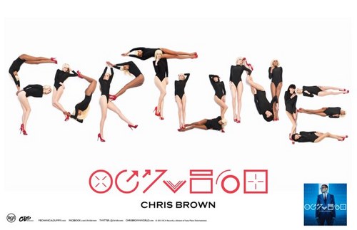
Posters
Posters were used to attract people and make them aware of the new album release. Women are used throughout both of the posters, again to attract the target audience (men) and therefore telling them about the album through the eye-catching displays. The idea of using women and sexualising them also fits with Laura Mulvey's theory, as there is evidence of that happening in these posters.
Colours
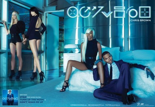
The dominant colour used throughout the marketing campaign was blue, which represents calm and relaxing moods. Red was used in the 1st poster (4th picture in) as red is seen as lustful and exciting, which is why women are making shapes with their bodies in order to spell out 'Fortune', the name of the album. Apart from this poster, the others give a technological, futuristic look through the use of different shades of blue. For example, the 2nd poster, (5th picture in) has the colour combination of white, blue and black, giving the futuristic, high-tec look.
What the Posters Connate
The posters again link with Laura Mulvey's theory of the male gaze. The women in the 2nd poster are posing as if they are actual plastic models, giving the idea that women are seen as the object, and the artist, Chris Brown, as the dominant figure. Chris Brown is also wearing a violet suit. Violet indicates royalty, but also imagination and creativity, which is what the artist may be trying to say about his album.
Along with the original version of the album, a special edition album was also released with bonus songs included, and a different album cover, for around £3 extra than the standard version. Because of platforms such as iTunes and Youtube, people can listen to clips of the songs before actually purchasing them. In-fact, because of the internet, it is possible to download the complete special edition album for free within minutes. Fans of the artist are much more likely to purchase the physical, special edition album, instead of purchasing the standard one.
Font
The font of the album was extreme unique as the actual lettering had been created by the artist/record label themselves. They conducted a 'scavenger hunt' for fans to answer, with prizes to be won. The coding telling people what the symbols mean't allowed fans to interact with each other through the unique style of font. The font also appeared on all the posters and the album itself, giving continuity but innovation to the album cover and marketing campaign.
Posters
Posters were used to attract people and make them aware of the new album release. Women are used throughout both of the posters, again to attract the target audience (men) and therefore telling them about the album through the eye-catching displays. The idea of using women and sexualising them also fits with Laura Mulvey's theory, as there is evidence of that happening in these posters.
Colours
The dominant colour used throughout the marketing campaign was blue, which represents calm and relaxing moods. Red was used in the 1st poster (4th picture in) as red is seen as lustful and exciting, which is why women are making shapes with their bodies in order to spell out 'Fortune', the name of the album. Apart from this poster, the others give a technological, futuristic look through the use of different shades of blue. For example, the 2nd poster, (5th picture in) has the colour combination of white, blue and black, giving the futuristic, high-tec look.
What the Posters Connate
The posters again link with Laura Mulvey's theory of the male gaze. The women in the 2nd poster are posing as if they are actual plastic models, giving the idea that women are seen as the object, and the artist, Chris Brown, as the dominant figure. Chris Brown is also wearing a violet suit. Violet indicates royalty, but also imagination and creativity, which is what the artist may be trying to say about his album.