Production Logo
This is the production Logo that we have designed to be on our digipack and magazine covers. We chose this design because of its simplicity but effectiveness that it had. We looked at other logos associated with the orginal artist of the song, and based our ideas around how these logos looked. These are the logos that are associated with our artist (Drake). The constant use of black and white told us ours should be black and white too. This allows our logo to fit in with the other logos linked to the artist.

The E.R.C.A logo was based around, the logos that were associated with Drake, were used as a guideline. We went with a black and white logo with the backdrop shadow, to give a 3D effect. As the logos that were associated with Drake were also mainly black and white, we felt it would be appropriate for us to do this too. The font and simplicity of the logo gave it class, which went well with the digipack, that was a leather wallet, and the music video itself, which was in black and white too.

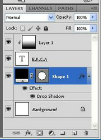
This is the 'Layers' Panel that i used to create the logo. I started with a simple black circle against a white background. I then added the drop shadow to the circle to make it look 3D, and to make it stand out from the white background. I then added the text 'E.R.C.A.' in Napa font. After this, i added another layer and created a White to Black gradient, and then made a clipping mask so that the gradient would only go over the layer of the text. Combining all this together, i then exported the image as a PNG to get rid of the white background, and then put it on the Weebly.
